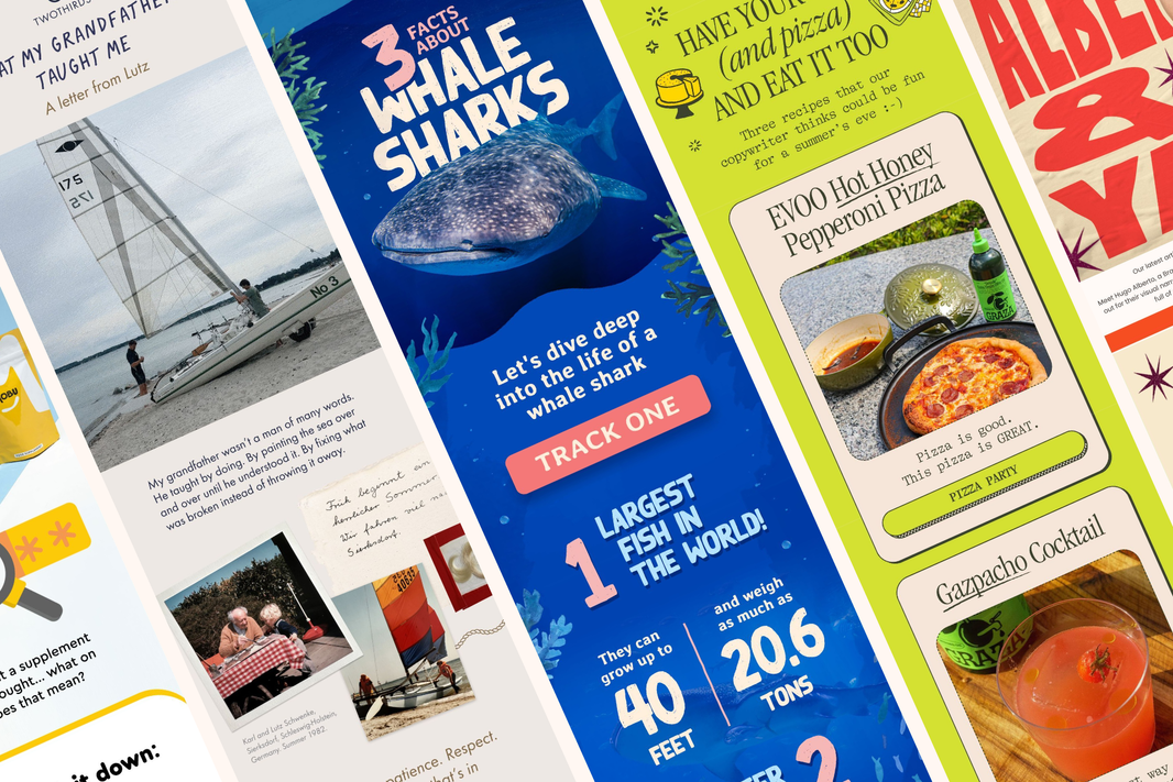
Author: Karl Howlett (Designer at Get Better)
May has brought us a taste of summer and a standout selection of emails that have truly caught our eye. Here’s what inspired the design team this month.

Purolabs
Subject: Ditch that extra coffee... ☕
Preview: Keep your energy steady all day long with these essential B vitamins
This email from Purolabs transforms what is traditionally a complex and overwhelming science-based product into a fun, easy-to-understand experience through the use of engaging graphics. It encourages the reader to continue scrolling and learning about the brand without feeling overwhelmed or intimidated.
Purolabs has mastered the art of making the reader feel comfortable while engaging in their emails. Their soft wording is a refreshing, gentle approach that builds trust with the reader, reinforcing a long-lasting connection between the brand and the consumer.

The Citizenry
Subject: Back In Stock & 20% Off
Preview: The Memorial Day Event officially ends tomorrow!
The Citizenry has embraced a unique approach to their emails, utilising space to create a luxurious, effortless elegance that fosters a warm and comforting experience for the reader.
This adoption of soft-selling, paired with their clean and simple aesthetic, makes the email feel inviting and personal, conveying the brand’s sophistication and style with ease.

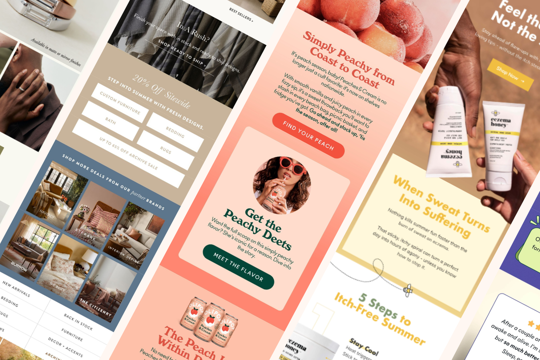
OLIPOP
Subject: It’s Peach Season 🍑
Preview: Peaches & Cream is now nationwide!
Instantly elevating the senses, this email from Olipop sparks our desire for a creamy, fruity drink on a warm summer day through its vibrant, mouth-watering graphics. When combined with Olipop’s captivating copy, it makes it hard for the reader to stop scrolling, helping to build brand loyalty even if they’re not yet ready to purchase; they know where to turn when the craving for a fruity, creamy drink hit.

Eczema Honey Company
Subject: Ready to love summer again?
Preview: Your summer eczema guide
The Eczema Honey Company engages readers by acknowledging their struggles and reassuring them that they’re not alone. Through a warm and empathetic tone of voice, they position themselves not just as a business, but as a friend trying to help with a credible, science-backed product. By building a meaningful connection, readers feel comforted and develop a unique trust with the brand, building the foundation for a long-lasting relationship.

Holden
Subject: would you wear this as your engagement 💍?!
Preview: new arrival: the corridor signet
Holden has mastered the art of letting its striking imagery take centre stage to convey the brand's beauty, luxurious style, and quiet sophistication. Jewellery is deeply personal, and Holden has beautifully reflected this in their gentle and unforced manner, inviting the reader to move through the email at their own pace, allowing each customer to enjoy their own journey.
In a world full of hard-sell messaging, this style of email stands out as a genuinely enjoyable experience, fostering long-term relationships through the promise of thoughtful, engaging, and rewarding content.